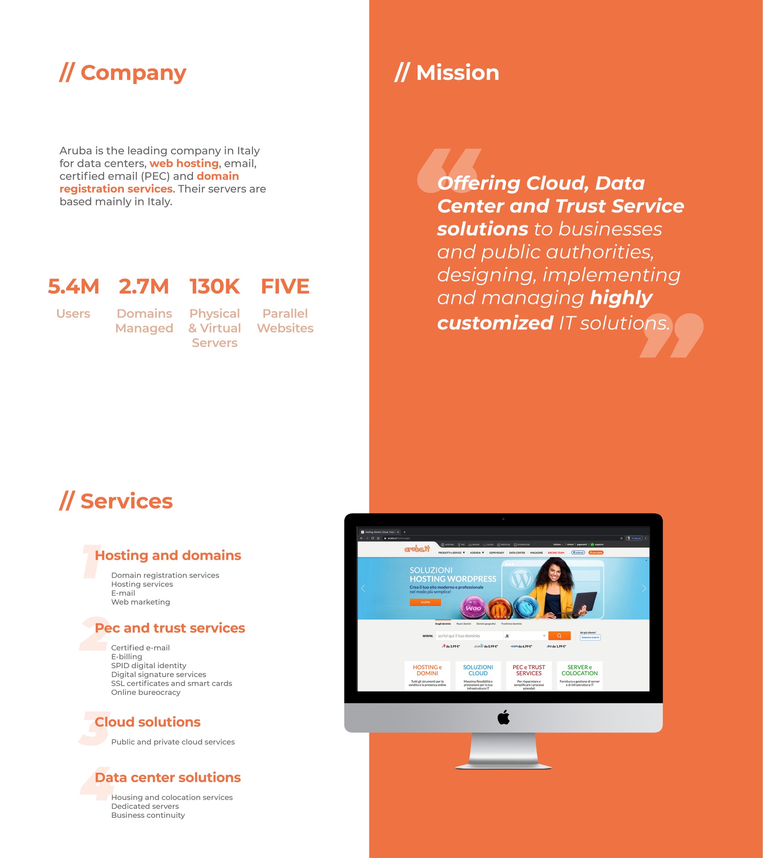
Aruba
Website Redesign
Skills


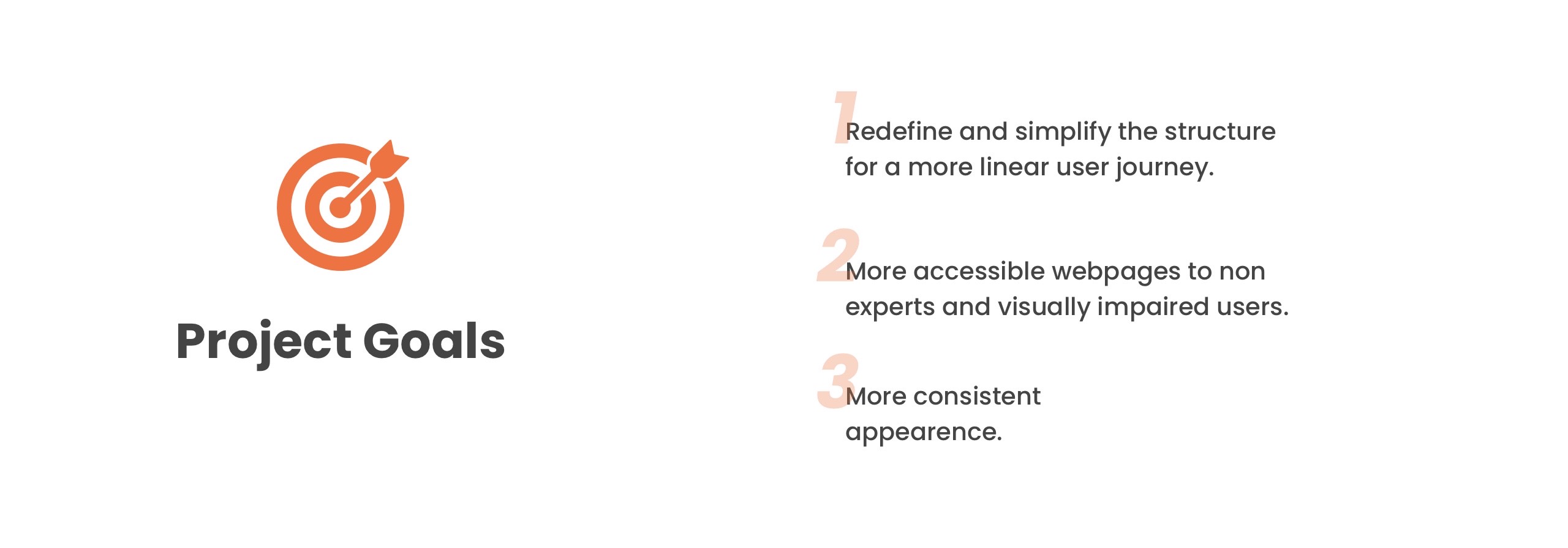


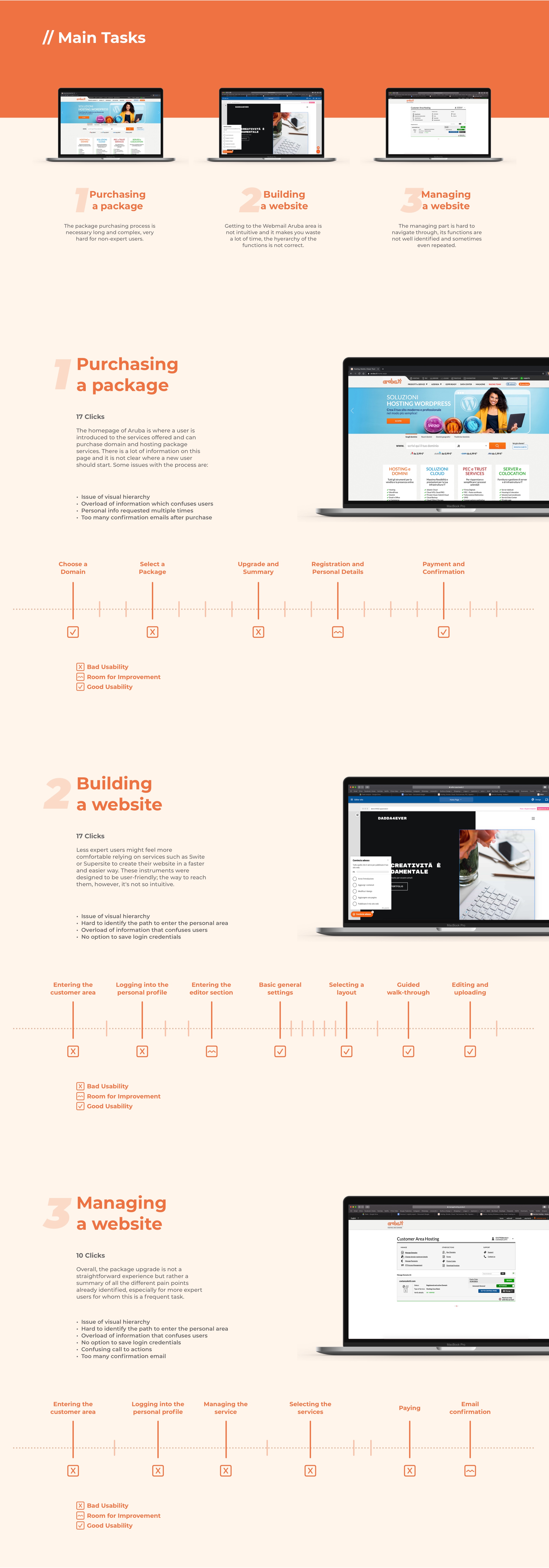


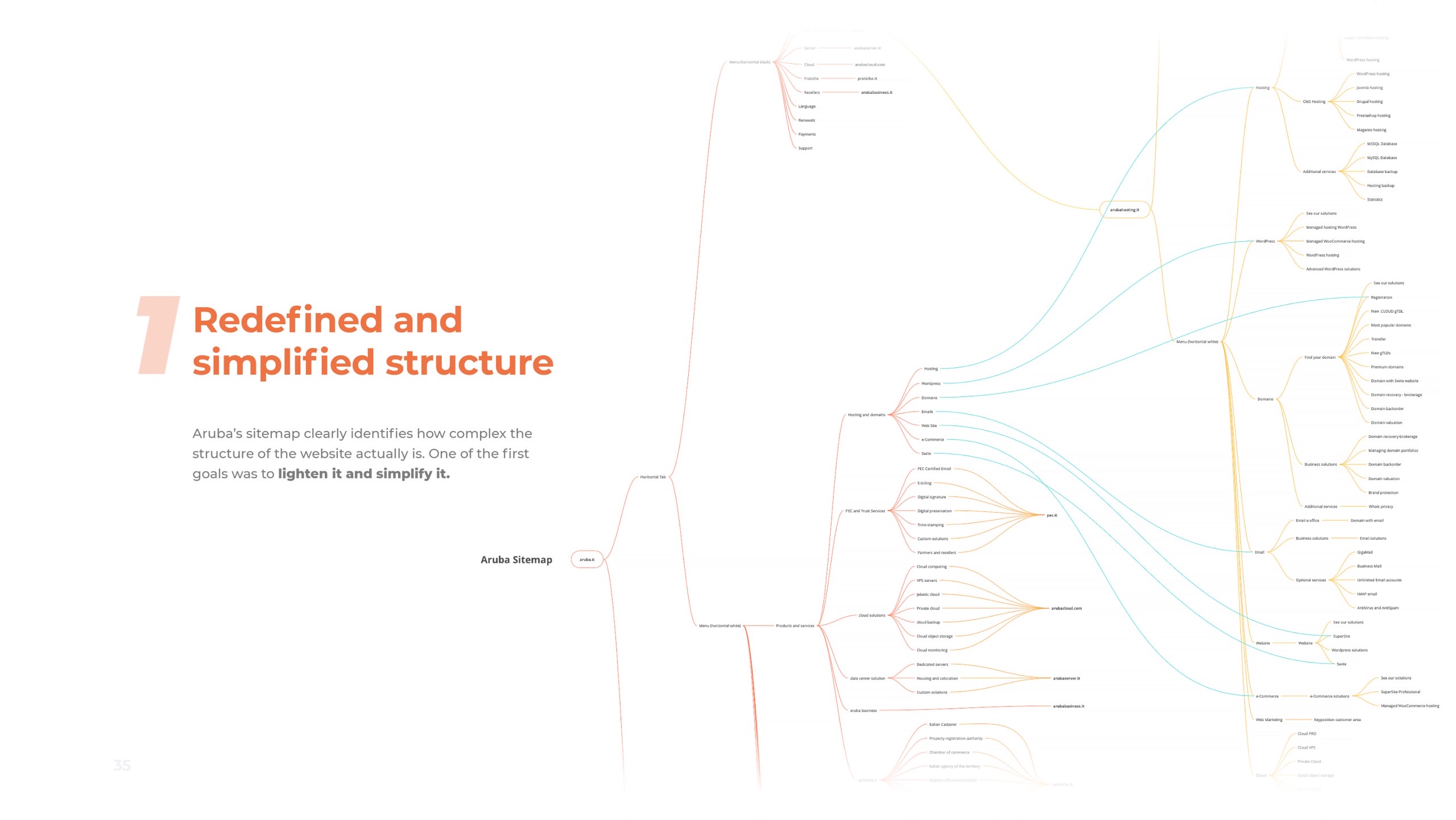
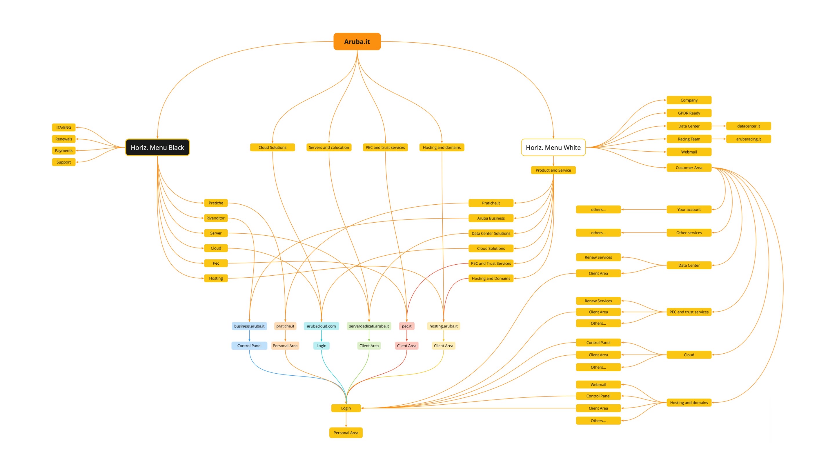
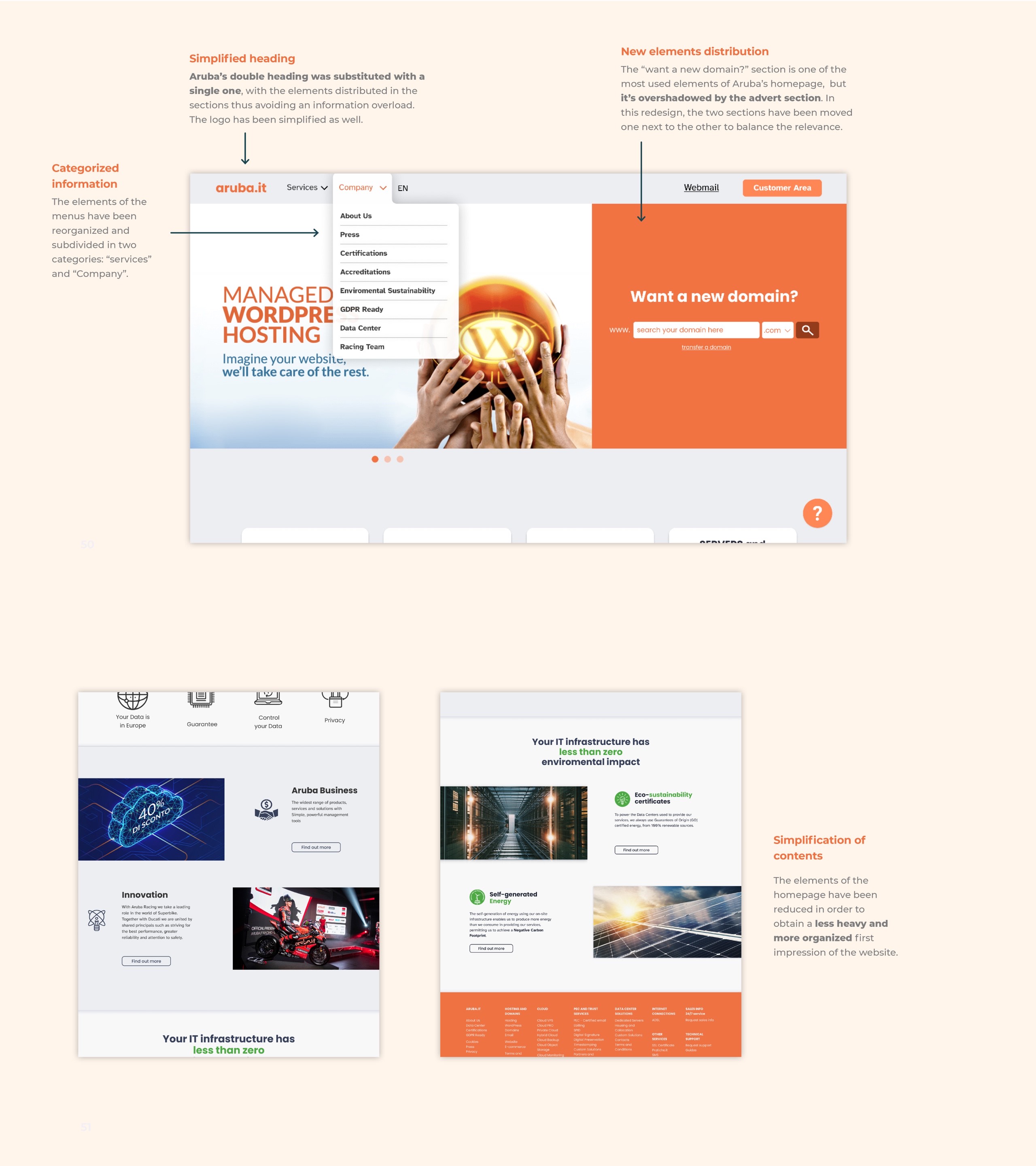
Simplified Sitemap
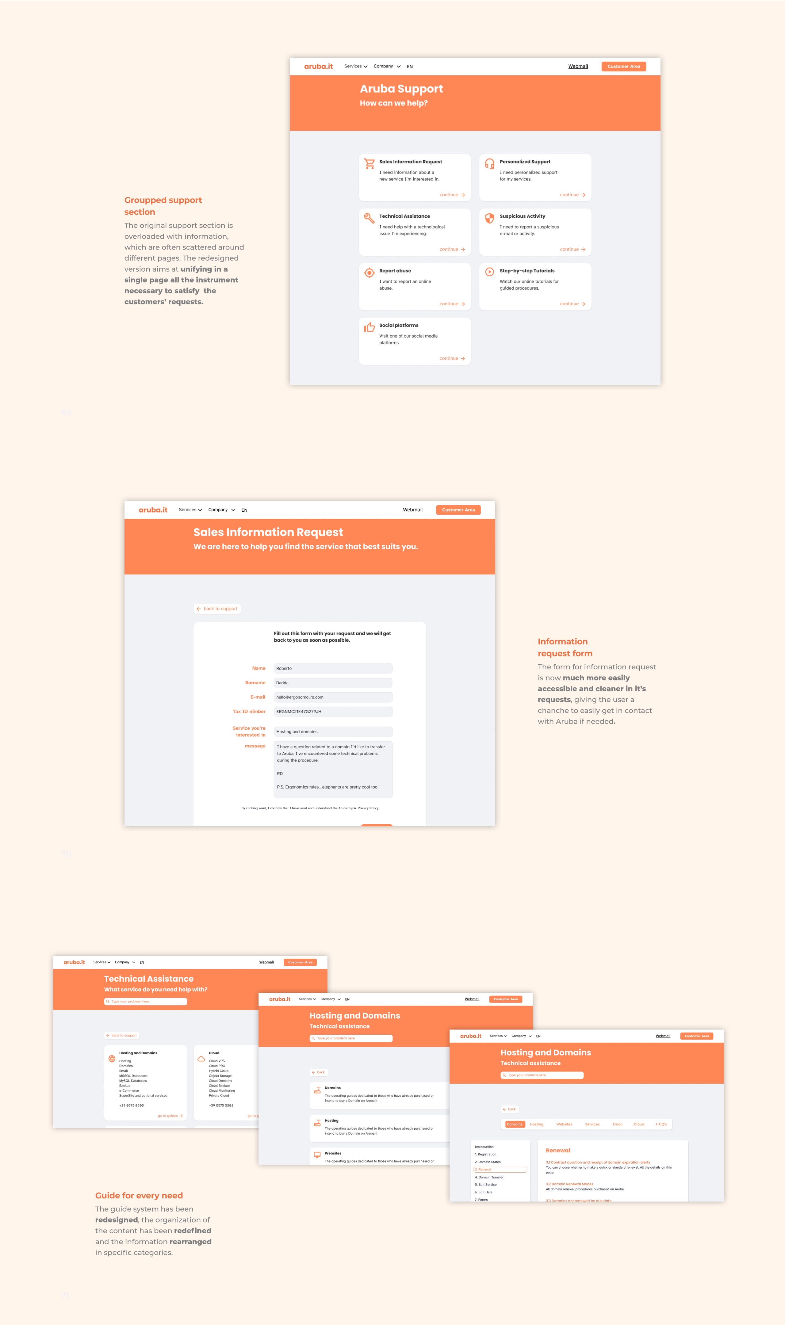
Many functions of Aruba's homepage are unnecessarily repeated multiple times on multiple menus, confusing the users and making any process unnecessarily lengthy and time-consuming.
The main goal of the sitemap redesign phase is reorganizing the structure of the different features in a more efficient and less time-consuming way, this reduces the number of steps necessary to operate every task.
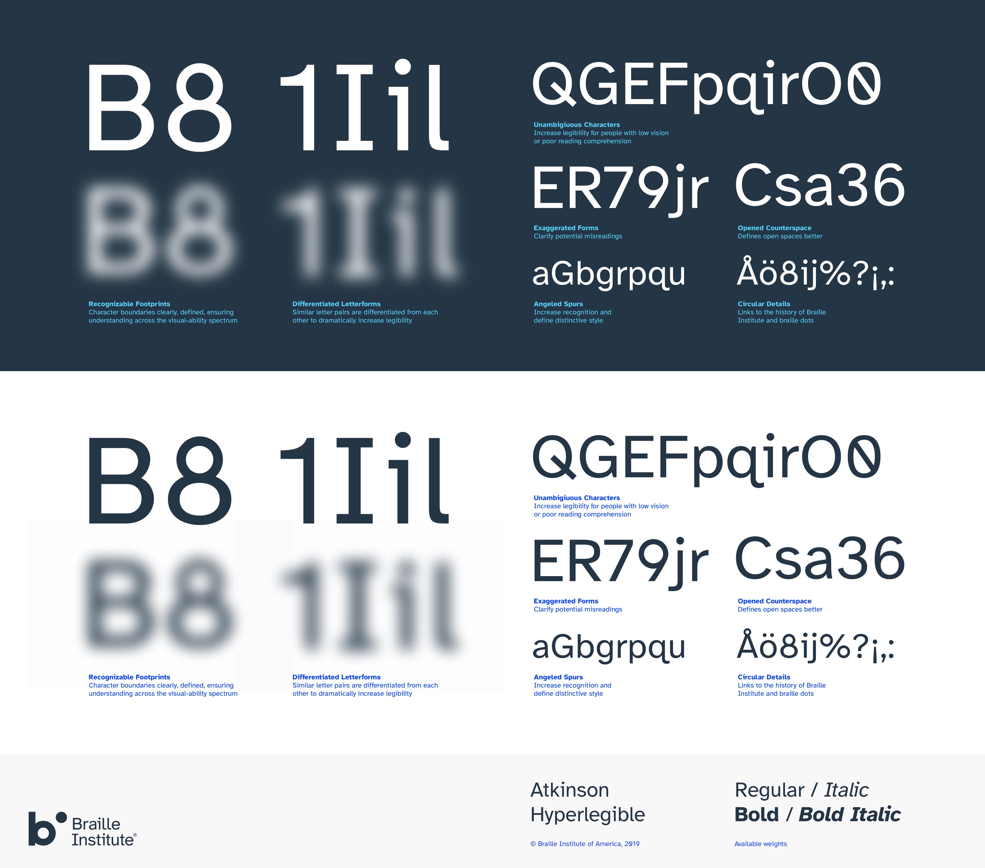
Typeface for
optimal legibility
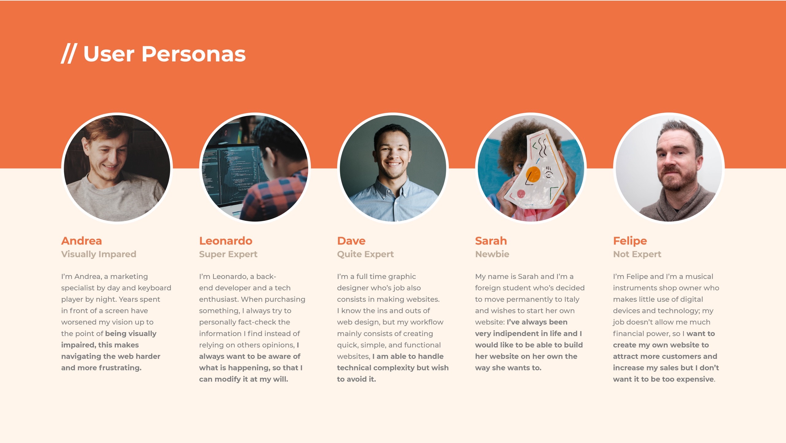
Graphic designer Applied Design Works collaborated with the nonprofit organisation Braille Institute to develop a "hyperlegible typeface" for the visually impaired community. The font family is composed of distinct and exaggerated letterforms to increase character recognition and the readability of written content, meeting the needs of people with low vision.
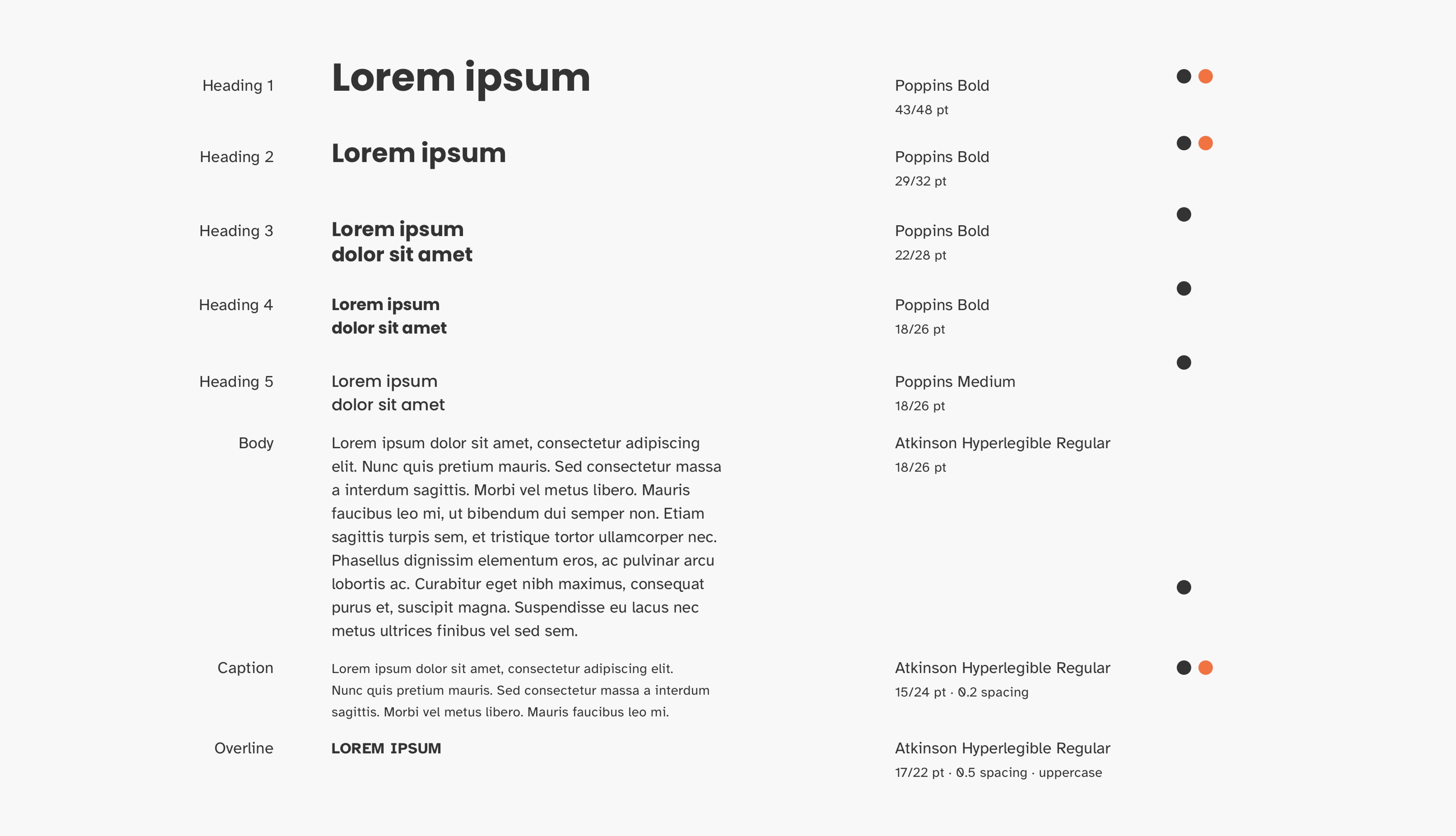
New Typeface Guidelines
The guidelines for the redesign were created using two different typefaces: Poppins has been used for headings and larger, short texts with an immediate visualization. Atkinson Hyperlegible was instead used for longer and smaller text and captions.
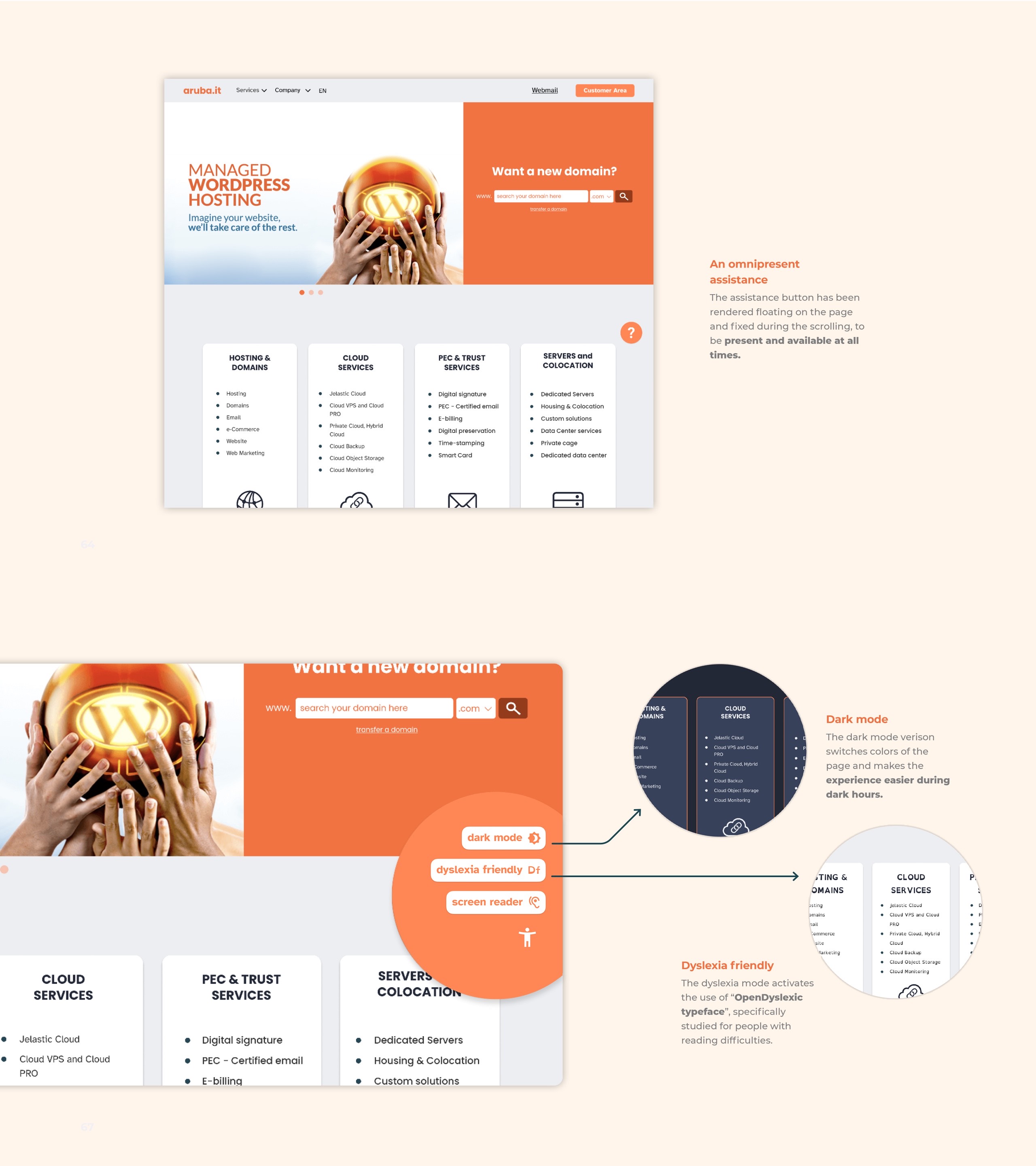
Color palettes and Themes
Few colours have been selected for each theme to avoid a chromatically overloaded appearance. A dark theme has been added as well, to allow users to interact with the webpage during night hours.
Each color has been tested for color blind users to ensure a wider accessibility. The test has been made with 4 types of color blindness: protanopia, deutanopia, trianopia and achromatopsia.
Elements Guidelines
Guidelines with all the elements necessary for the construction of the pages have been made.
A design system for a more coherent appearance and clearer interactions.